
ABOUT THE PROJECT
A complete brand identity system for Somherbs — a wellness brand harnessing the power of medicinal mushrooms and herbs. The challenge was designing an dentity that felt authentically rooted in Indian heritage while appealing to a modern, health-conscious audience.
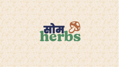
The name itself is the concept — Som (सोम) from Sanskrit, referencing the sacred Soma plant, merged with the English herbs. Two cultures, one mark.
PROJECT SCOPE
Logo system · Color palette · Typography hierarchy · Brand pattern · Usage guidelines across packaging, digital, and print.
The Approach
Every decision was intentional. Before a single mark was drawn, I mapped the cultural landscape, the competitor space, and the sensory world the brand inhabits.
01
Discovery
Deep-diving into the wellness space, competitor landscape, and the cultural significance of Soma in Ayurvedic tradition
to establish a strong conceptual foundation.
02
Concept
Developing the bilingual logo concept — the seamless merge of Devanagari and Latin scripts as a visual metaphor for the brand's dual cultural identity.
03
Design
Refining the color system, typographic hierarchy, and brand patterns to ensure consistency and flexibility across all brand touchpoints.
04
Guidelines
Documenting all brand decisions in a comprehensive guide, ensuring the identity can be applied consistently by any designer or vendor in the future.


Initial
Explorations
I began with experimenting with colors, font pairings and brand-marks. The client specified that he needed a bilingual logo, so it became a starting point.
Final logo

The brand logo is an amalgamation of Hindi and English typeface which seamlessly merges into each other. The width of the font and spacing has been adjusted to be displayed perfectly over digital and print mediums.
Every element,
intentional
TYPEFACE · POPPINS
Poppins was selected as the brand's primary typeface for its geometric warmth, wide weight range, and open-source accessibility via Google Fonts — free to use across all future applications.
BLACK / 900
Ancient Wisdom
BOLD / 700
Ancient Wisdom
MEDIUM / 500
Ancient Wisdom
REGULAR / 400
Ancient Wisdom
LIGHT / 300
Ancient Wisdom
COLORS
The palette was drawn directly from nature — deep forest green of moss-covered earth, warm creamof dried botanicals, and the vivid green of new growth.
PRIMARY
Forest Green
#1A433F
Headlines, backgrounds
PRIMARY
Warm Cream
#D8CDB8
Backgrounds, surfaces
ACCENT
Leaf Green
#3CB86A
Highlights, emphasis
SECONDARY
White
#FFFFFF
Text, clean surfaces
SECONDARY
Black
#000000
Body text, details


Packaging
The packaging serves as a tactile bridge between ancient Ayurvedic wisdom and modern ritual. Featuring the bilingual logo, the design balances Devanagari and Latin scripts to honor the brand's roots while ensuring clarity for the global wellness enthusiast.
A system built
to grow
The final brand identity delivered a complete, scalable design system — ready for launch across
packaging, digital, and retail environments.
01
LOGO SYSTEM
Four logo variants across backgrounds,
with tagline integration, spacing rules,
and minimum size specs.
Five-color system — two primaries, one
accent, two secondaries — with clear
usage guidelines for each role.
02
COLOR PALETTE
03
TYPE HIERARCHY
Poppins across five weights with defined
roles from display to body copy. Free
and web-safe for all future use.
04
BRAND PATTERN
Mushroom-motif repeating pattern in two
colorways, ready for packaging, web,
and print collateral.
05
BRAND GUIDELINES
A comprehensive document covering
every element for consistent application
by any future designer or vendor.
06
DUAL-MEDIUM READY
All assets optimised for both digital
screens and physical print — retina
displays to CMYK packaging.